
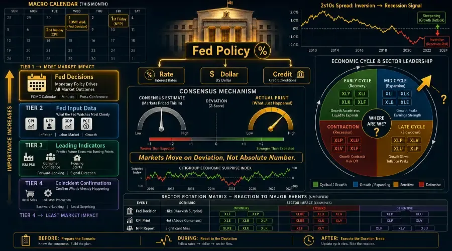
No other category in this series generates more market-moving events per calendar month than macroeconomic data. Every month, without exception, the market receives a Fed decision or minutes release, a CPI print, a jobs report, a GDP estimate, a consumer confidence reading, retail sales data, ISM manufacturing figures, and housing numbers. That is eight to twelve scheduled high-impact events in thirty days – every thirty days.
For traders with a systematic framework, this is not noise. It is a structured opportunity calendar – one of the most reliable engines of macro events trading. The same data releases, arriving on the same schedule, moving markets through the same transmission channels – predictably enough to position ahead of, during, and after each event with a clear thesis. If you’ve ever wanted an economic calendar trading strategy that turns monthly macro data into a playbook, you’ve found the right page.
This is the largest hub in the series because macroeconomic events are the largest category of market catalyst. The twelve posts here cover every major US economic release and explain what each one signals about the economic cycle, how it transmits through sectors, and what the trade is before, during, and after the print.
Why Macro Data Events Are the Highest-Opportunity Category for Systematic Traders
Every other hub in this series covers events that arrive without a fixed schedule – oil spikes, gold rallies, geopolitical crises, central bank policy shifts. You cannot put them on a calendar. You can only monitor for them and react when they arrive.
Macro data events are different. They are scheduled in advance, released at a known time, on a known date, in a known format, against a known consensus estimate. The Bureau of Labor Statistics publishes the NFP jobs report on the first Friday of every month at 8:30am Eastern, without exception. CPI arrives on the second or third Tuesday. GDP estimates arrive on a fixed quarterly schedule. The Fed meets eight times per year, every year, with the decision announced at 2:00pm Eastern.
This scheduling creates a category of catalyst that rewards preparation over reaction. The traders who extract the most consistent value from macro events are not the fastest to react to the headline – they are the most prepared for the range of outcomes before the data lands.
This hub is structured to support exactly that preparation: understanding the transmission mechanism for each release, building the sector rotation thesis for each scenario, and entering each data event with a clear before/during/after framework ready to execute.
The Master Framework: It Is Always About the Fed
Every macroeconomic data release in this hub ultimately matters because of one thing: its implication for Federal Reserve policy. The Fed sets the price of money – the federal funds rate – which is the most important single variable in asset pricing. Every piece of economic data the market receives is processed through the lens of what it means for the next Fed decision.
This creates a hierarchy that every macro trader must internalize:
Tier 1 – Direct Fed Decisions:
The federal funds rate decision itself (eight times per year) and the Fed Chair's press conference commentary. These are the primary catalyst events. Everything else in this hub is secondary to these.
Tier 2 – Fed Input Data:
The reports the Fed explicitly monitors and cites in its statements – CPI (inflation mandate), NFP jobs report (employment mandate), PCE deflator (preferred inflation measure), and GDP (overall growth). These are the data points that change the probability of the next Fed move and therefore produce the largest market reactions.
Tier 3 – Leading Economic Indicators:
Data that signals where Tier 2 numbers are heading – ISM Manufacturing PMI (leads industrial production), consumer confidence (leads consumer spending), housing starts (leads construction and the broader economic cycle). These move markets when they deviate sharply from expectations because they change the probability distribution of future Tier 2 data.
Tier 4 – Coincident Confirmations:
Retail sales, consumer spending, industrial production – these confirm what is already happening. They produce smaller market reactions on their own because they are telling the market what it has largely already priced through Tier 3 signals.
Understanding this hierarchy stops you from over-trading low-signal releases and under-trading high-signal ones.
The Consensus Mechanism: Why the Number Itself Is Not the Trade
The most important concept in macro event trading – and the one most consistently misunderstood by retail participants – is that the market moves on the deviation from consensus expectations, not on the absolute value of the data.
A 200,000 jobs added NFP print is bullish if consensus was 150,000. The same 200,000 print is bearish if consensus was 280,000. The data did not change – only its relationship to expectations.
This is why the pre-event consensus estimate, published by Bloomberg, Reuters, and others in the days before each release, is as important to track as the release itself. Before every major macro event, the market has priced a specific expected outcome. The trade comes from anticipating where the consensus is wrong – or from positioning for the sector rotation that the consensus-matching outcome will produce even without a surprise.
The Citigroup Economic Surprise Index tracks whether economic data is coming in above or below consensus across all major releases. When this index is rising (data consistently beating expectations), the market is in a reflationary positioning phase – cyclical sectors outperform defensives. When it is falling (data consistently missing), the market shifts toward defensive positioning. Monitoring the direction of this index, rather than individual data points, gives you the macro positioning signal that sits above any single release. This is the heart of learning how macro data moves markets – it’s not about one number, it’s about the aggregate surprise trend.
The Economic Cycle Map: How Macro Data Fits Together
Individual macro releases are more valuable when understood as signals of where the economy sits in its cycle. The four phases of the economic cycle produce distinct sector leadership patterns – and the sequence of macro data releases tells you which phase you are in and which transition is approaching.
Early Cycle (Recovery):
NFP accelerating from low levels. ISM Manufacturing crossing back above 50. Consumer confidence recovering. Housing starts rising. Rate cuts already delivered. Sector leadership: Consumer Discretionary, Industrials, Technology, Financials. Defensives underperform.
Mid Cycle (Expansion):
NFP strong and consistent. CPI moderate and rising. GDP growing above trend. ISM Manufacturing comfortably above 55. Sector leadership: Broad market participation. Cyclicals and growth both work. Energy often joins.
Late Cycle (Peak):
NFP still positive but decelerating. CPI elevated – the Fed is now hiking or holding at restrictive levels. ISM Manufacturing starting to roll over. Consumer confidence peaking. Yield curve flattening or inverting. Sector leadership: Energy, Materials, Healthcare, Consumer Staples. Growth stocks and rate-sensitives underperform.
Contraction (Recession):
NFP negative. CPI falling but sticky. GDP contracting. ISM Manufacturing below 50 for multiple consecutive months. Housing starts collapsing. Sector leadership: Consumer Staples, Healthcare, Utilities. Everything cyclical underperforms sharply.
The macro data releases in this hub are the signposts that tell you which phase is active and when a transition is imminent. The most important transitions to catch early are: Late Cycle to Contraction (the NFP deceleration + yield curve inversion combination is the most reliable warning signal) and Contraction to Early Cycle (ISM Manufacturing crossing back above 50 from below, with NFP turning positive, is the most reliable recovery signal).
Sector Reaction Matrix: Twelve Events, Four Scenarios Each
Rather than a single sector map, macro events require a matrix approach – each release can land as a beat, a miss, a hot print, or a cold print, and each produces a different sector rotation. Below is the master rotation framework for the five highest-impact releases. You’ll notice that sector rotation after Fed meeting outcomes tends to follow duration and credit channels, while rotation after CPI or NFP prints often hinges on the immediate rate re-pricing.
(A quick reference: XLE=Energy, XLB=Materials, XLI=Industrials, XLK=Technology, XLU=Utilities, XLRE=Real Estate, XLY=Consumer Discretionary, XLP=Consumer Staples, XLC=Communication Services, XLV=Healthcare, XLF=Financials.)
Fed Rate Decision
🔺 Hike (hawkish surprise)
✅ Immediate Winners
- XLF (NIM expansion)
- XLP (defensive)
❌ Immediate Losers
- XLRE
- XLU
- XLK (duration-sensitive)
1–3 Month Winners
- XLE
- XLB (if driven by inflation)
Market Read
Higher rates pressure duration-sensitive sectors immediately, while commodity-linked sectors can benefit later if inflation remains elevated.
🔻 Cut (dovish surprise)
✅ Immediate Winners
- XLRE
- XLU
- XLK
❌ Immediate Losers
- XLF (NIM compression)
1–3 Month Winners
- XLY
- XLI (growth sectors)
Market Read
Falling rates support long-duration assets first, followed by broader growth and cyclical recovery trades.
Hold + hawkish language
✅ Immediate Winners
- XLF
- XLP
❌ Immediate Losers
- XLRE
- XLK
1–3 Month Winners
- XLE
- XLB
Market Read
Even without a rate hike, hawkish language tightens financial conditions through expectations and bond yields.
Hold + dovish language
✅ Immediate Winners
- XLRE
- XLK
- XLY
❌ Immediate Losers
- XLF
1–3 Month Winners
- XLI
- XLC
Market Read
Markets interpret dovish language as future easing potential, supporting risk appetite and growth-sensitive sectors.
CPI Print
Hot CPI (above consensus)
✅ Immediate Winners
- XLE
- XLB
- XLP
❌ Immediate Losers
- XLRE
- XLK
- XLY
Market Read
Hot inflation increases expectations for Fed tightening and higher yields.
Cold CPI (below consensus)
✅ Immediate Winners
- XLRE
- XLK
- XLY
❌ Immediate Losers
- XLE
- XLB
Market Read
Lower inflation increases the probability of a dovish Fed pivot.
In-line CPI
✅ Immediate Winners
- Minimal rotation
❌ Immediate Losers
- Minimal rotation
Market Read
Consensus confirmation usually reduces volatility and keeps positioning stable.
Hot Core, Cold Headline
✅ Immediate Winners
- XLRE
- XLK (mild recovery)
❌ Immediate Losers
- XLE (sells the news)
Market Read
Markets focus more heavily on core inflation because the Fed prioritizes persistent inflation pressures.
NFP Jobs Report
Strong Beat
✅ Immediate Winners
- XLF
- XLI
- XLY
❌ Immediate Losers
- XLRE
- XLU (rate risk rises)
⚠️ Market Read
Strong labor data supports growth but may increase expectations for tighter monetary policy.
Significant Miss
✅ Immediate Winners
- XLRE
- XLU
- XLK
❌ Immediate Losers
- XLF
- XLY (recession fear)
Market Read
A major jobs miss increases recession concerns and accelerates dovish Fed expectations.
Goldilocks Report (moderate growth)
✅ Immediate Winners
- Broad market positive
❌ Immediate Losers
- Minimal
Market Read
Moderate growth with contained inflation is the ideal soft-landing environment.
Weak Jobs + Rising Wages
✅ Immediate Winners
- XLRE
- XLU
❌ Immediate Losers
- XLF
- XLY
Market Read
This is a stagflationary signal: slowing growth combined with persistent wage inflation.
ISM Manufacturing PMI
Drops Below 50
✅ Immediate Winners
- XLP
- XLV
- XLU
❌ Immediate Losers
- XLI
- XLB
- XLE
Market Read
Industrial contraction signals slowing earnings growth and weaker cyclical demand.
Falls Sharply Below 50
✅ Immediate Winners
- XLP
- XLV
❌ Immediate Losers
- XLI
- XLB
- XLY
Market Read
A deep PMI contraction is historically associated with recession risk.
Crosses Back Above 50
✅ Immediate Winners
- XLI
- XLB
- XLY
❌ Immediate Losers
- XLP
- XLV
Market Read
This is one of the clearest early-cycle recovery signals in macro trading.
New Orders Sub-Index Falls
✅ Immediate Winners
- Defensive sectors gradually outperform
❌ Immediate Losers
- XLI
- XLB
Market Read
New orders are the most forward-looking PMI component and often lead broader industrial weakness.
10-Year Treasury Yield
Yield Spikes Sharply
✅ Immediate Winners
- XLF (short-term)
❌ Immediate Losers
- XLRE
- XLU
- XLK
Market Read
Higher yields mathematically compress valuations for long-duration assets.
Yield Collapses
✅ Immediate Winners
- XLRE
- XLU
- XLK
❌ Immediate Losers
- XLF
Market Read
Falling yields support growth valuations but may also signal recession or deflation fears.
Yield Curve Inverts
✅ Immediate Winners
- XLP
- XLV
- XLU
❌ Immediate Losers
- XLI
- XLB
Market Read
Yield curve inversions have historically preceded recessions by 12–18 months.
Curve Steepens (bear steepener)
✅ Immediate Winners
- XLF
- XLE
- XLB
❌ Immediate Losers
- XLK
- XLRE
Market Read
A bear steepener usually reflects rising inflation expectations or reflationary growth conditions.
The Yield Curve: The Macro Signal That Aggregates Everything
Of all the indicators covered in this hub's twelve posts, the US Treasury yield curve – specifically the spread between the 2-year and 10-year Treasury yields – is the single most powerful macro signal available to traders. It aggregates the market's collective judgment about growth, inflation, and Fed policy into one number.
When the curve is steep (10-year yield well above 2-year):
The market expects future growth and inflation – the Fed is likely to tighten. Cyclical sectors (XLI, XLB, XLE, XLF) outperform. This is early-to-mid cycle positioning.
When the curve is flat:
The market is uncertain about the future trajectory. Sector dispersion falls – nothing works convincingly. The Fed is approaching the end of a tightening or easing cycle.
When the curve inverts (2-year yield above 10-year):
The market believes the Fed's current rate level will damage the economy enough to require future cuts. This is the most reliable recession predictor in financial market history – the 2-year/10-year inversion has preceded every US recession since 1960 with a lead time of 6–18 months. XLP, XLV, and XLU outperform. XLI, XLB, and XLY underperform as recession probability is priced in.
The 2022–2023 inversion case study:
The 2-year/10-year spread inverted in March 2022 and reached its deepest inversion since 1981 in October 2022 (approximately -108 basis points). The subsequent economic slowdown – visible in slowing GDP, deteriorating ISM Manufacturing, and weakening consumer confidence through 2023 – confirmed the inversion's signal. The curve remaining inverted for over two years (2022–2024) was the longest sustained inversion since the early 1980s. Defensive sector positioning (XLP, XLV, XLU) significantly outperformed during this period relative to cyclicals.
Monitoring yield curve shape as a backdrop to every individual macro data release significantly improves the reliability of the sector rotation signals described throughout this hub.
The Dollar as a Macro Transmission Lever
The US dollar (tracked by the DXY index) is both a macroeconomic data outcome and a transmission mechanism that affects every sector in the economy. Two of the twelve posts in this hub cover the dollar directly – but it appears as a secondary factor across nearly all the others.
The dollar's three sources of movement:
Rate differential:
The Fed raising rates faster than other central banks strengthens the dollar – attracting capital seeking higher yields. This is the most sustained and powerful dollar driver.
Risk sentiment:
During global risk-off episodes, capital flows into dollar assets as a safe haven, strengthening the dollar regardless of rate differentials.
Growth differential:
When the US economy is growing faster than the rest of the world, the dollar strengthens as international investors seek US assets.
The dollar's sector impact is consistent across all macro scenarios:
- Dollar strengthening is uniformly negative for commodity prices (in dollar terms), negative for emerging markets, and negative for multinational revenue translation (XLK, XLV, XLP all have significant overseas earnings)
- Dollar weakening is uniformly positive for commodities, positive for emerging markets, and positive for multinational earnings
Every macro data print that changes rate expectations also changes dollar expectations. Build the dollar impact into your sector rotation thesis as an automatic second-order step after every macro event analysis.
Key Historical Macro Events and What They Produced
2022: The Fastest Hiking Cycle Since 1980
The Fed raised rates from 0.25% in March 2022 to 5.50% by July 2023 – 525 basis points in 16 months. The sector impact was the most dramatic in decades: XLRE fell 29% in 2022 (the worst sector). XLU fell 1.5%. XLK fell 33% as growth stock DCF models were crushed by rising discount rates. XLF initially outperformed as net interest margin expanded, then underperformed as credit risk accumulated. XLE gained 58% – the only sector with a genuine fundamental offset to the rate headwinds. The 2022 cycle is the definitive modern case study for rate hike transmission across sectors.
2020: Emergency Cuts to Zero and the Recovery
The Fed cut rates to zero in March 2020 and deployed $3 trillion in asset purchases. XLRE and XLU bounced first from the March lows. XLK led the broader recovery as growth stock valuations were supercharged by near-zero discount rates. XLY housing-related stocks (homebuilders) surged throughout 2020–2021 as the mortgage rate benefit reached consumers. This cycle illustrates the full positive transmission of the rate cut playbook – with fiscal stimulus amplifying every stage.
2019: The Insurance Cut Cycle
Three Fed rate cuts in July, September, and October 2019 – framed as "insurance" against slowing growth rather than recession response. XLRE gained 29% in 2019 (the best sector). XLU gained 26%. XLK gained 50% as falling rates combined with tech momentum. This is the case study for the rate cut transmission in a non-crisis environment – the orderly, full-year deployment of the rate-sensitive sector trade.
2008: NFP and the Jobs Market Collapse
Non-farm payrolls turned negative in January 2008, eight months before the Lehman collapse. The jobs market data was the earliest public confirmation – available to every retail trader – that the US economy was entering recession. XLY began its multi-year underperformance. XLP and XLV held up relative to the market. Traders who positioned on the January 2008 NFP miss – rather than waiting for the September 2008 Lehman event – had an eight-month head start on the defensive rotation trade. This is the most powerful argument for taking macro data misses seriously as leading signals, not just lagging confirmations.
How to Trade Macro Data Events: The Universal Three-Phase Checklist
Unlike commodity hubs where the checklist varies by commodity type, macro events share a universal pre/during/post structure that applies across all twelve posts in this hub. One practical note: macro releases can gap on surprise prints, so position size accordingly – defined risk keeps you in the game even when the number lands well outside the consensus range.
Before every macro data release:
- Record the consensus estimate from Bloomberg/Reuters/FactSet – this is your benchmark for interpreting the result
- Check current Fed funds futures pricing (CME FedWatch Tool) – this shows what the bond market is pricing for the next Fed decision, which frames how surprising any data deviation will be
- Identify your high-conviction sector reaction for each of the three scenarios: beat, in-line, miss
- Note the yield curve shape – is a data beat arriving into a steep or flat curve? The curve shape amplifies or mutes the sector reaction
During the release:
- Compare the actual print to consensus immediately – the deviation, not the absolute number, is the signal
- Watch the 2-year Treasury yield first – it reprices the fastest and most accurately reflects the Fed policy implication
- Then watch the dollar – it confirms whether the rate implication is global or US-specific
- Then watch sector ETF divergence – the order in which sectors move confirms which transmission channel is dominant
After the release (the duration trade):
- Assess whether the print changes the economic cycle phase – a single miss rarely does, but three consecutive misses in Tier 2 data signals a phase transition
- Update the CME FedWatch probability – if the market has repriced the next Fed decision significantly, the rate-sensitive sector trade has a new entry point
- Set a reminder for the next release in the same category – macro data has serial correlation; a strong NFP print raises the probability of the next NFP also being strong
Trading from outside the US? The same tiered framework applies to ECB, BOJ, and PBOC data releases – just use local sector indices to mirror the rotation logic
Twelve Macro Events Covered in This Hub
→ What Happens When the Fed Raises Interest Rates (High priority – 3,000+ monthly searches)
The highest-traffic post in the entire series. Covers the three simultaneous transmission channels (rate, dollar, credit), the sector rotation playbook for both surprise hikes and consensus hikes, the XLF net interest margin expansion dynamic, the 2022 hiking cycle as the primary case study, and why the pace of hikes matters more than the absolute rate level for sector impact. [link]
→ What Happens When the Fed Cuts Interest Rates (High priority – 3,000+ monthly searches)
The mirror image of the hike playbook – but with important asymmetries. Emergency cuts (crisis response) produce different sector reactions than insurance cuts (slowdown prevention). Covers 2019 insurance cuts, 2020 emergency cuts, and the rate-sensitive sector trade duration in each scenario. [link]
→ What Happens When the 10-Year Treasury Yield Spikes (High priority – 1,500+ monthly searches)
The 10-year yield is the benchmark rate for mortgages, corporate borrowing, and equity discount rates. Its spikes compress valuations across the economy. Covers the three causes of yield spikes (inflation, growth, supply) and why each cause has different equity implications – a yield spike driven by stronger growth is bullish for cyclicals; a yield spike driven by inflation is bearish for everything except commodities. [link]
→ What Happens When the US Dollar Rallies (High priority – 1,200+ monthly searches)
Covers the three sources of dollar strength, the commodity price inverse relationship, the multinational earnings translation hit, and the emerging market stress channel. The 2014–2015 dollar rally (+25%) is the primary case study. [link]
→ What Happens When the US Dollar Weakens (High priority – 1,000+ monthly searches)
The dollar weakness playbook covers the commodity tailwind, multinational earnings boost, and EM asset rally. The 2020–2021 dollar decline (-13%) is the primary case study. Also covers the reserve currency dynamics that limit how far dollar weakness typically goes before intervention risk rises. [link]
→ What Happens When CPI Inflation Comes in Hot (High priority – 1,500+ monthly searches)
The most politically charged economic release of the past decade. Covers headline vs. core CPI distinction, the Fed reaction function, the sector rotation between commodity-linked and rate-sensitive assets, and why hot CPI in a hiking cycle produces different sector implications than hot CPI in a cutting cycle. [link]
→ What Happens When the Jobs Report (NFP) Misses Badly (High priority – 1,200+ monthly searches)
The highest-frequency Tier 2 data event. Covers the NFP beat/miss matrix, the birth-death model revision dynamic (why the initial print is often not the true signal), the wage growth component (most important sub-indicator), and the historical precedent of the January 2008 miss as an early recession signal. [link]
→ What Happens When GDP Growth Slows Sharply (High priority – 1,000+ monthly searches)
GDP is a lagging indicator – but sharp revisions, particularly from positive to negative, are major market catalysts. Covers the three GDP estimates (advance, second, third), the sector leadership changes that typically precede GDP deceleration by two to three quarters, and the two-consecutive-negative-quarters technical recession definition and its market impact. [link]
→ What Happens When Consumer Confidence Collapses (Medium priority – 700+ monthly searches)
Consumer confidence surveys (Conference Board and University of Michigan) are leading indicators for consumer spending. Covers the predictive relationship between confidence and XLY performance, the three-to-six month lead time, and the historical cases where confidence collapse preceded recession by a quarter or more. [link]
→ What Happens When Retail Sales Disappoint (Medium priority – 600+ monthly searches)
Retail sales is the most direct measure of consumer spending, which is 70% of US GDP. Covers the control group (the Fed's preferred retail measure), the seasonal adjustment distortions that cause false signals, and the XLY sub-sector divergence between discretionary and staples when retail data is weak. [link]
→ What Happens When ISM Manufacturing PMI Falls Below 50 (Medium priority – 600+ monthly searches)
ISM Manufacturing PMI below 50 signals industrial contraction. Covers the new orders sub-index as the most forward-looking component, the relationship between sub-50 readings and XLI earnings, the historical accuracy of sustained sub-50 readings as recession predictors, and the global PMI correlation (ISM tends to lead or confirm global industrial slowdowns). [link]
→ What Happens When Housing Starts Collapse (Medium priority – 600+ monthly searches)
Housing is the most interest-rate-sensitive sector in the US economy and the most reliable leading indicator of economic cycles. Covers the mortgage rate transmission mechanism, the XLY homebuilder sub-sector as the primary equity expression, the XLRE commercial real estate divergence from residential, and why housing starts turning down typically precedes the broader economic slowdown by two to four quarters. [link]
Continue Through the Catalyst Series
→ Pillar: The Complete Market Catalyst Framework
→ Hub 1: Energy Commodities – Oil, Gas, Uranium
→ Hub 2: Industrial & Base Metals – Copper, Steel, Lumber
→ Hub 3: Precious Metals – Gold, Silver, Platinum
→ Hub 4: Agricultural Commodities – Wheat, Corn, Soybeans
→ Hub 6: Central Bank & Policy – QE, Tapering, Tariffs, Tax
→ Hub 7: Geopolitical Events – Wars, Elections, OPEC, EM Crisis
Frequently Asked Questions
1. Why do macroeconomic events move the stock market?
Macroeconomic events change expectations for Federal Reserve policy, interest rates, economic growth, and corporate earnings. Markets react to how data compares to consensus expectations.
2. Why is the Fed the most important market catalyst?
The Federal Reserve controls interest rates and liquidity conditions, which directly impact borrowing costs, stock valuations, bonds, housing, and the US dollar.
3. What happens when CPI inflation comes in hot?
A hot CPI print usually increases expectations for Fed rate hikes. This hurts growth and rate-sensitive sectors like Technology and Real Estate while helping Energy and commodity-linked sectors.
4. Why does the jobs report matter so much?
The Non-Farm Payrolls (NFP) report measures labor market strength. Strong jobs data supports economic growth but can also increase inflation and Fed tightening expectations.
5. What does a yield curve inversion mean?
A yield curve inversion happens when short-term Treasury yields rise above long-term yields. Historically, it has been one of the most reliable recession indicators.
6. How do Treasury yields affect stocks?
Rising Treasury yields increase discount rates and borrowing costs, hurting growth stocks and rate-sensitive sectors. Falling yields usually support Technology and Real Estate stocks.
7. What sectors perform best during rate cuts?
Technology, Real Estate, Utilities, and Consumer Discretionary sectors usually benefit the most from falling interest rates.
8. What is the Economic Surprise Index?
The Economic Surprise Index measures whether macroeconomic data is coming in above or below market expectations. Rising readings support cyclical sectors, while falling readings favor defensive sectors.
9. Why is ISM Manufacturing PMI important?
ISM Manufacturing PMI is a leading indicator for industrial activity and economic growth. Readings above 50 signal expansion, while readings below 50 indicate contraction.
10. What happens when GDP growth slows sharply?
Slowing GDP growth usually increases recession fears, weakens cyclical sectors, and boosts defensive sectors like Healthcare, Utilities, and Consumer Staples.
All content on BreakoutBulletin is for educational purposes only and does not constitute financial advice or a recommendation to buy or sell any security.