
BreakoutBulletin | BB Macro Intelligence Series
Part of the Macro Intelligence Master Guide
Educational commentary only. Not investment advice.
Why Yields Move Before Prices Do
Most retail traders begin their day by checking stock prices. Professional traders typically start somewhere else – bond yields – because yields shape equity valuations before price action reflects the change.
Bond yields sit upstream of stock prices. They influence how companies are valued, how capital is allocated, and how risk is perceived across asset classes. By the time a yield-driven move shows up clearly in equities, the signal has already been visible in bonds for days or weeks. Understanding this relationship shifts market reading from reactive to anticipatory.
This connection between yields and equity behaviour is one of the primary inputs into the Market Regime Identification Framework – the yield environment shapes the regime classification before any sector or stock analysis begins.
The 10-Year Treasury Yield: How It Anchors Equity Valuations
The 10-year Treasury yield functions as the discount rate benchmark for the entire financial system. It determines borrowing costs for governments, corporations, and consumers. More directly for equity investors, it sets the rate at which future earnings are discounted back to present value.
When this yield rises, the present value of future cash flows declines. This compresses stock valuations, particularly for companies whose earnings lie far into the future. Growth stocks feel this pressure most acutely because their intrinsic value depends heavily on earnings projected years or decades out – the discount rate mechanism is explained in detail in Why Rising Interest Rates Hurt Growth Stocks.
The 10-year yield in isolation tells only part of the story. The fuller picture comes from how short-term and long-term yields interact – the yield curve.
The Yield Curve: Shape Matters More Than Level
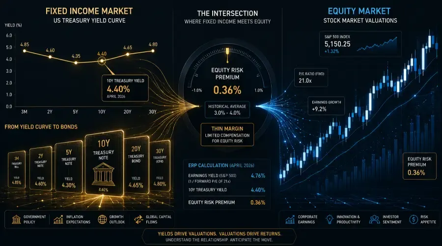
The yield curve plots yields across different maturities, from 3-month Treasury bills to the 30-year bond. Its shape reflects the market's collective expectation about growth, inflation, and future monetary policy – and it has a direct bearing on which equity sectors attract capital.
Normal (upward sloping): Long-term yields exceed short-term yields, reflecting expectations of economic expansion and moderate inflation. Equity markets tend to perform well in this environment. Financials and industrials often lead, as economic momentum supports loan demand and capital spending.
Flat: The spread between short and long-term yields has compressed. This signals slowing momentum and is frequently associated with a shift toward quality and defensive positioning in equities.
Inverted: Short-term yields exceed long-term yields. This configuration has preceded every US recession since 1955. Defensive sectors – Consumer Staples, Healthcare, Utilities – typically attract capital as recession risk rises. The behaviour of defensives during curve inversions is covered in Defensive Stocks Explained.
As of 2026, the yield curve has moved back into positive territory after an extended inversion in 2022–2023. This normalisation signals fading recession fears and stabilising growth expectations – a development that changes the sector rotation implications considerably.
Real Yields vs Nominal Yields: The Valuation Driver Most Traders Miss
Most yield discussions focus on nominal rates. The variable that more directly drives equity valuation is the real yield – the nominal yield minus the expected inflation rate.
The distinction matters because the two tell different stories about economic conditions.
When nominal yields rise because inflation expectations are rising, the market can often absorb the move. Rising inflation expectations typically signal nominal economic growth, which supports corporate revenue. The rate rise is uncomfortable but not necessarily valuation-destroying.
When real yields rise – meaning the yield increase exceeds the change in inflation expectations – the cost of capital is genuinely increasing. This is when valuations compress sharply, particularly for long-duration assets. Real yields track the actual return investors receive after inflation, and growth stocks are highly sensitive to changes in this figure because their value depends on distant earnings discounted at the real rate.
In April 2026, real yields remain elevated at approximately 2.1% (10-year TIPS yield). This continues to act as a structural constraint on high-multiple growth sectors, even as nominal yields have stabilised near 4.4%.
How Yield Changes Drive Sector Rotation
Different sectors respond to yield changes based on how their business models interact with interest rates. This rotation follows a consistent logic that connects directly to the Sorting Hat framework.
| Yield Environment | Benefiting Sectors | Facing Headwinds |
|---|---|---|
| Rising yields + steepening curve | Financials, Energy, Industrials | Technology, REITs, long-duration growth |
| Falling yields + flattening curve | Technology, Consumer Discretionary, REITs | Financials (margin compression) |
| Inverted curve (rising short rates) | Defensives, short-duration value | Cyclicals, financials |
| Normalising curve (from inversion) | Financials, Cyclicals, small caps | Defensives (relative outperformance fades) |
Financials benefit from rising yields because the spread between borrowing costs (short-term deposits) and lending rates (longer-term loans) expands, improving net interest margins. This is the direct mechanism behind financial sector outperformance during yield-steepening environments.
Growth stocks face headwinds from rising yields through two channels simultaneously: the discount rate applied to future earnings rises, compressing present value; and the relative attractiveness of equities vs risk-free bonds declines as bond yields approach earnings yields. The sector rotation implications of these yield environments are one of the primary drivers of quarterly leadership changes across the S&P 500.
The Equity Risk Premium: Stocks vs Bonds
At any point, investors are implicitly deciding between equities and bonds. This decision is framed by the equity risk premium – the excess return investors expect from stocks over risk-free government bonds to compensate for the additional risk of holding equities.
The calculation uses the earnings yield (the inverse of the P/E ratio) minus the 10-year Treasury yield.
Example using April 2026 levels:
- S&P 500 forward P/E: approximately 21x
- Earnings yield: 1 ÷ 21 = 4.76%
- 10-year Treasury yield: 4.4%
- Equity Risk Premium: 4.76% − 4.4% = 0.36%
A premium of 0.36% is historically thin. The long-run average equity risk premium is closer to 3–4%. At current levels, equities are offering minimal compensation over risk-free Treasuries. This narrows the margin for error: even modest earnings disappointments or yield increases can trigger disproportionate equity selloffs because the relative valuation cushion is limited. Note that the earnings yield here is based on forward operating earnings estimates; actual ERP can be even tighter if those estimates are revised lower, something worth monitoring as each earnings season unfolds.
This dynamic also shapes the risk-on vs risk-off environment. A thin equity risk premium is consistent with a selective risk-off regime where bad news produces outsized reactions.
What to Track Daily
Three yield-related inputs carry the most analytical weight in daily market preparation.
10-year Treasury yield direction – Is it rising or falling, and at what pace? A 5–6 basis point daily move is notable. A 10+ basis point move is significant and warrants immediate regime reassessment.
2-year vs 10-year spread (yield curve slope) – A widening spread (steepening) is generally positive for financials and risk assets. A narrowing spread (flattening) signals caution. An inversion (negative spread) historically precedes recession by 6–18 months.
10-year TIPS yield (real yield) – Available daily from the US Treasury. Rising real yields compress growth valuations regardless of what nominal yields are doing. Falling real yields support growth stocks even if nominal yields are stable.
These three inputs integrate into the Step 1 macro classification in the Daily Market Analysis Framework, alongside VIX and credit spread data.
Where We Are Now: April 2026
The yield picture in April 2026 presents a mixed environment. The 10-year nominal yield is near 4.4%, elevated by historical standards but stable over the past six weeks. The yield curve has normalised into slight positive territory (+20 basis points 2s10s), signalling that the recession fears of 2022–2023 have faded.
Real yields at 2.1% remain the primary constraint on growth sector valuations. For the equity risk premium to widen to more comfortable levels – providing better protection against earnings disappointments – either earnings would need to improve significantly or nominal yields would need to decline.
The next CPI release and FOMC meeting carry the most weight in determining whether yields move meaningfully from current levels. The Economic Calendar Trading Framework covers how to read market behaviour around these specific events.
Key Takeaways
| Concept | Summary |
|---|---|
| 10-year yield | Sets the discount rate for all equity valuations; growth stocks most sensitive |
| Yield curve shape | Normal = expansion; flat = slowing; inverted = recession risk |
| Real vs nominal yields | Real yields drive valuation compression; nominal rises from inflation are more tolerable |
| Equity risk premium | April 2026: approximately 0.36% – historically thin; limited margin for error |
| Sector rotation | Rising yields favour Financials; falling yields favour Growth; inversion favours Defensives |
| Daily tracking | 10-year yield direction, 2s10s spread, TIPS real yield |
Go Deeper: Breakout Bulletin Macro Intelligence Series
If you're new to the series, start with The Sorting Hat for Stocks – it builds the foundation that ties all these yield signals together.
- The Sorting Hat for Stocks – Master guide to all four macro stock groups
- How to Read the Stock Market Like a Professional: The 5-Layer Framework – How yield signals feed into the daily trading process
- Why Rising Interest Rates Hurt Growth Stocks – The discount rate mechanism in detail
- How a Strong Dollar Affects the S&P 500 – How yield differentials drive dollar cycles
- Defensive Stocks Explained – How defensives behave during yield curve inversions
- Sector Rotation Strategy – How yield environments drive quarterly sector leadership changes
- Risk-On vs Risk-Off Markets Explained – How the equity risk premium shapes regime classification
- Market Regime Identification Framework – Applying yield signals to regime classification
- Daily Market Analysis Framework – Integrating yield inputs into the daily process
- Economic Calendar Trading Framework – How CPI and FOMC events drive yield moves
This article is published by BreakoutBulletin for educational purposes only. It does not constitute investment advice or a recommendation to buy or sell any security. All yield levels and equity risk premium calculations reference approximate April 2026 market data and are provided for illustrative purposes only. Past performance is not indicative of future results. BreakoutBulletin is an educational content platform and is not a registered investment advisor, broker-dealer, or financial institution.