
Most retail traders encounter yield curve analysis through its recession indicator reputation. The 2-year yield rises above the 10-year, the media runs the historical inversion chart, and the story stops there. That's roughly 20% of what the curve actually communicates.
A systematic yield curve analysis is simultaneously a recession signal, a sector rotation strategy tool, a monetary policy indicator, and a real-time read on what the bond market believes about the future path of growth and inflation. The sector implications of different curve configurations are specific, historically consistent, and directly actionable. AI-assisted trading workflows translate that data into sector implications efficiently – when given the right inputs and the right questions.
Yield curve analysis is the sixth strategy application in the Strategy-Specific Applications with AI hub. It gives the full overview and explains why strategy-specific AI use produces more actionable output than generic macro commentary.
The Yield Curve as a Sector Rotation Signal
The mechanism behind macro-driven trading using the yield curve is straightforward. Different sectors carry different interest rate sensitivity, and the curve communicates the market's current view on where rates are heading and why.
A utility company pays a predictable dividend that competes with Treasury income. When long-term yields rise significantly, a Treasury bond paying 5% becomes a more compelling income alternative than a utility dividend with equity risk attached. Investors rotate out. A bank, by contrast, earns its margin from the spread between short-term funding costs and long-term lending rates. When that spread widens – a steepening curve – net interest margins expand and financials tend to outperform. A long-duration technology company, whose valuation depends on earnings expected far in the future, faces a higher discount rate when long-term yields rise, compressing the multiple the market will pay.
These are the institutional market mechanisms that make yield curve configuration one of the most reliable sector rotation signals available – not a day-trading tool, but a directional bias that operates over weeks and months.
What Data to Use: Three Yields and the Spreads
Treasury spread analysis requires three data points and the relationships between them.
The 2-year yield is the most policy-sensitive point – it tracks Fed rate expectations closely. The 10-year yield reflects a blend of policy, growth, and inflation expectations, and directly affects long-term borrowing costs across the economy. The 30-year yield is most sensitive to long-term inflation expectations and fiscal concerns.
The yield curve's configuration reflects what the bond market believes the Fed will do. How to Interpret Fed Statements and Macro News with AI covers how to extract the rate path signals from FOMC language that drive yield curve moves.
The two spreads define the curve's shape. The 10-year minus 2-year is the standard steepness measure – below zero signals inversion, which has historically preceded recessions by 12 to 18 months. The 30-year minus 10-year captures the long-end configuration.
Format the data as a table with current yields, one-month changes, and three-month changes. Both the level and direction of movement are essential inputs. The three-month trend is particularly important: it filters out short-term noise and identifies whether rates are in a genuine structural move – which is what institutional capital responds to – rather than a sentiment-driven fluctuation.
Identifying the Current Yield Curve Regime
The curve sits in one of three primary configurations. Bear steepening: long yields rise faster than short yields, typically driven by rising inflation expectations or fiscal concerns. Flattening: the spread narrows toward inversion, usually a late-cycle signal as the Fed tightens while the market prices in future growth deterioration. Inverted: short yields exceed long yields.
One important nuance on re-steepening: the initial inversion is the warning signal. The more immediately equity-relevant phase is when the 10Y-2Y spread moves back toward zero from inversion – the historical moment when recessionary dynamics begin to materialise rather than merely being signalled.
Yield curve configuration is one of the five inputs to macro regime classification. How to Identify Macro Regimes with AI covers how the curve shape combines with GDP trend, CPI direction, PMI, and credit spreads to classify the current regime and translate it into broader positioning decisions.
Use this prompt to identify the regime:
Act as a macro analyst reviewing Treasury yield curve data. Based only on the data I've provided: (1) identify the current regime – steepening, flattening, or inverted – and specify whether a steepening is bull or bear driven based on which end of the curve is moving more; (2) assess the 10Y-2Y spread and note whether any re-steepening from inversion has begun; (3) assess the absolute level of the 10-year yield relative to the 4.5% threshold at which utilities and REITs typically face headwinds from competing income alternatives – noting this is a rule of thumb sensitive to current dividend yields and the broader inflation regime, not a mechanical trigger; (4) identify whether the primary rate pressure is coming from the short end or the long end. Yield data: [paste table]. Do not introduce rate forecasts beyond what the data implies.Sector Implications by Regime
Bear steepening: Financials (XLF) typically benefit as net interest margins expand. Energy (XLE) is relatively insulated – commodity earnings are driven by oil prices, not rate dynamics, making it a relative safe harbour when interest rate sensitivity is the primary concern. Utilities (XLU) and REITs (XLRE) face headwinds when the 10-year yield moves above 4.5%, as the income comparison with Treasuries shifts against equity dividends. Long-duration technology faces valuation compression as the discount rate on future earnings rises.
Flattening: Financials face margin compression headwinds. Rate-sensitive income sectors find relative support as long-end yield pressure eases. If the flattening is growth-driven, defensive vs. cyclical allocation typically shifts toward defensives.
Inverted: Financials are structurally squeezed. Consumer staples, healthcare, and utilities tend to outperform as investors price in recessionary dynamics. The re-steepening phase that follows inversion is historically the most acute period of equity market stress.
Yield curve signals and sector rotation analysis work as complementary tools. How to Run Sector Rotation Analysis with AI covers how to run that ETF analysis and how to cross-reference it with the curve reading.
October 2023: A Complete Walkthrough
October 2023 produced a textbook yield curve and sector rotation example – the 10-year Treasury's push toward 5% for the first time since 2007.
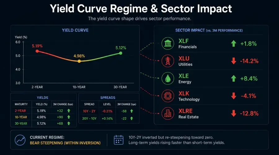
| Maturity | Yield | Change (3M) |
|---|---|---|
| 2-Year | 5.19% | +0.32% |
| 10-Year | 4.98% | +0.90% |
| 30-Year | 5.12% | +0.68% |
| Spread | Level |
|---|---|
| 10Y-2Y | -0.21% |
| 30Y-10Y | +0.14% |
The regime: bear steepening within an inverted curve. The 10-year rose approximately 90 basis points over three months – significantly faster than the 2-year's 32-basis-point move. A wider negative spread is a steepening move, not flattening. The 10Y-2Y remained inverted at -0.21% but was narrowing from its peak, with long-end pressure driving the narrowing rather than short-end cuts.
| ETF | Sector | 1-Month | 3-Month |
|---|---|---|---|
| XLU | Utilities | -8.4% | -14.2% |
| XLRE | Real Estate | -7.8% | -12.8% |
| XLK | Technology | -6.2% | -4.1% |
| XLF | Financials | -3.4% | -1.8% |
| XLE | Energy | -2.1% | +8.4% |
| SPY | S&P 500 | -5.4% | -5.8% |
The alignment with yield curve predictions was nearly complete. Utilities down 14.2% and REITs down 12.8% – the income competition mechanism expressing precisely as the rate environment predicted, with the 10-year well above the 4.5% threshold. Energy's relative insulation confirmed the commodity-not-rate-driven earnings profile. Financials modestly underperforming SPY was the partial divergence – within an inverted curve, even a bear steepening on the long end doesn't fully support net interest margins while the short end remains above the long end.
One verification note: AI can mislabel regimes, particularly when steepening and flattening are occurring within an inversion simultaneously. Always manually confirm the spread direction against the pasted data before acting on the regime characterisation. The 10Y-2Y calculation takes 30 seconds to verify and catches the most consequential type of analytical error.
Building Yield Curve Analysis Into the Workflow
Run the yield curve update weekly – noting the current three yields, calculating the spreads, and updating the sector positioning framework if the configuration has shifted. This feeds directly into sector ETF momentum analysis: the rotation data tells you which sectors the market is rewarding, while the yield curve provides the mechanism – whether the structural forces support that trend continuing or reversing.
When the yield curve signal and sector performance diverge, that divergence is the signal. Utilities outperforming despite a 10-year yield above 4.5%? Something beyond the rate framework is at work – sector-specific regulatory changes, positioning dynamics, or a macro factor the curve isn't capturing. Identifying that driver is where the follow-up analysis needs to go, and often where the most significant alpha in defensive vs. cyclical allocation decisions is found.
Q&A: Yield Curve and Sector Rotation
Q: Why is the direction of yield movement often more important than the absolute level?
Markets are discounting mechanisms that respond to rate of change. A stable high-yield environment allows companies and investors to adapt capital allocation gradually. A rapid, large-scale shift in yields – regardless of the absolute level – immediately disrupts valuation models for growth stocks and income comparisons for dividend sectors, forcing sector rotation before earnings data can catch up.
Q: When does a divergence between the yield curve and sector performance become actionable?
When a sector fails to respond to a structural rate-driven headwind or tailwind that the curve clearly identifies. If the yield curve suggests financials should struggle in a flattening environment but the sector continues rallying, it signals a powerful exogenous driver – earnings surprises, M&A activity, or regulatory shifts – overriding macro expectations. Divergences are where the most durable alpha in macro-driven trading tends to surface, because most traders are watching the same rate signal and missing the override.
Q: How does the 3-month change help distinguish noise from a true regime shift?
Short-term yield moves are frequently sentiment or positioning driven. A 3-month trend filters that noise and captures the structural momentum that institutional capital actually responds to. This timeframe also aligns with the lag between yield curve signals and their expression in corporate earnings and sector performance – making it the right window for establishing directional bias rather than reacting to daily fluctuations.